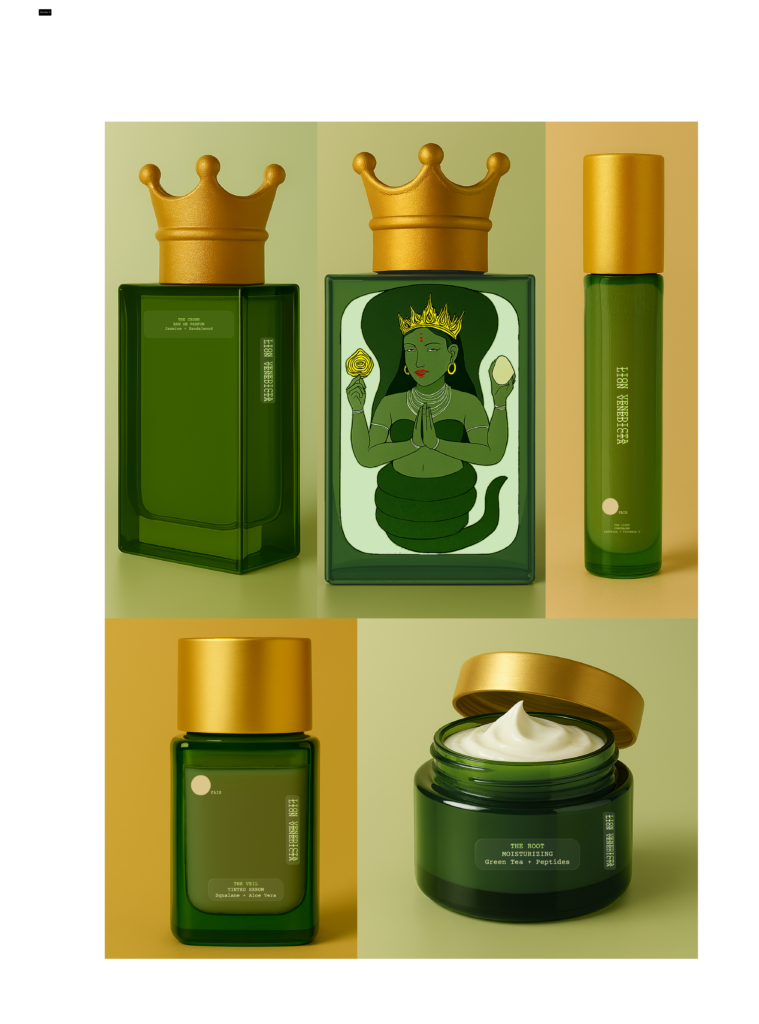
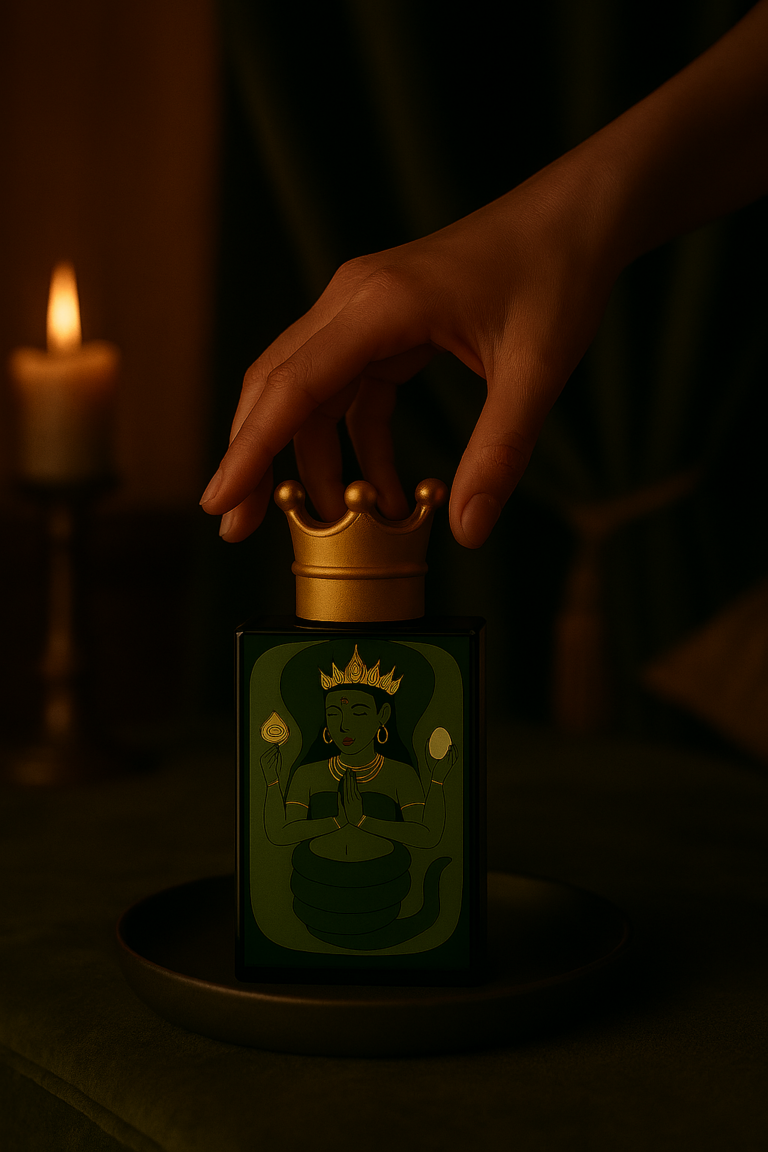
A key element of the brand is the perfume signature, designed as the energetic finishing layer of the ritual. Its scent seals the experience of the skincare, leaving a subtle aura of purity and mystique.
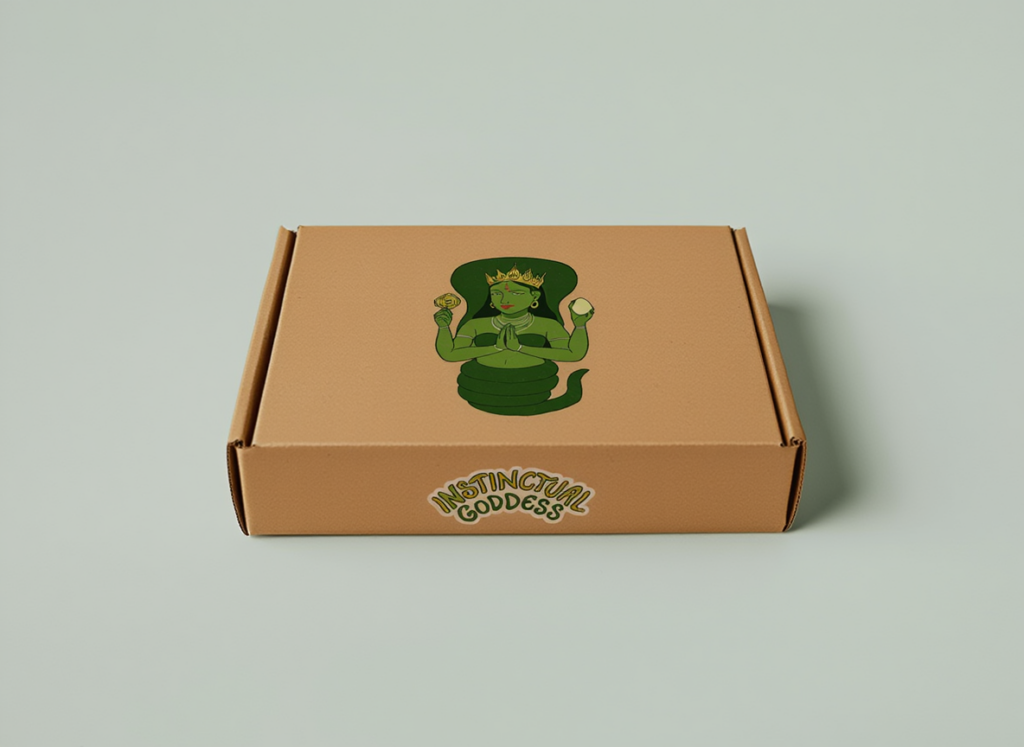
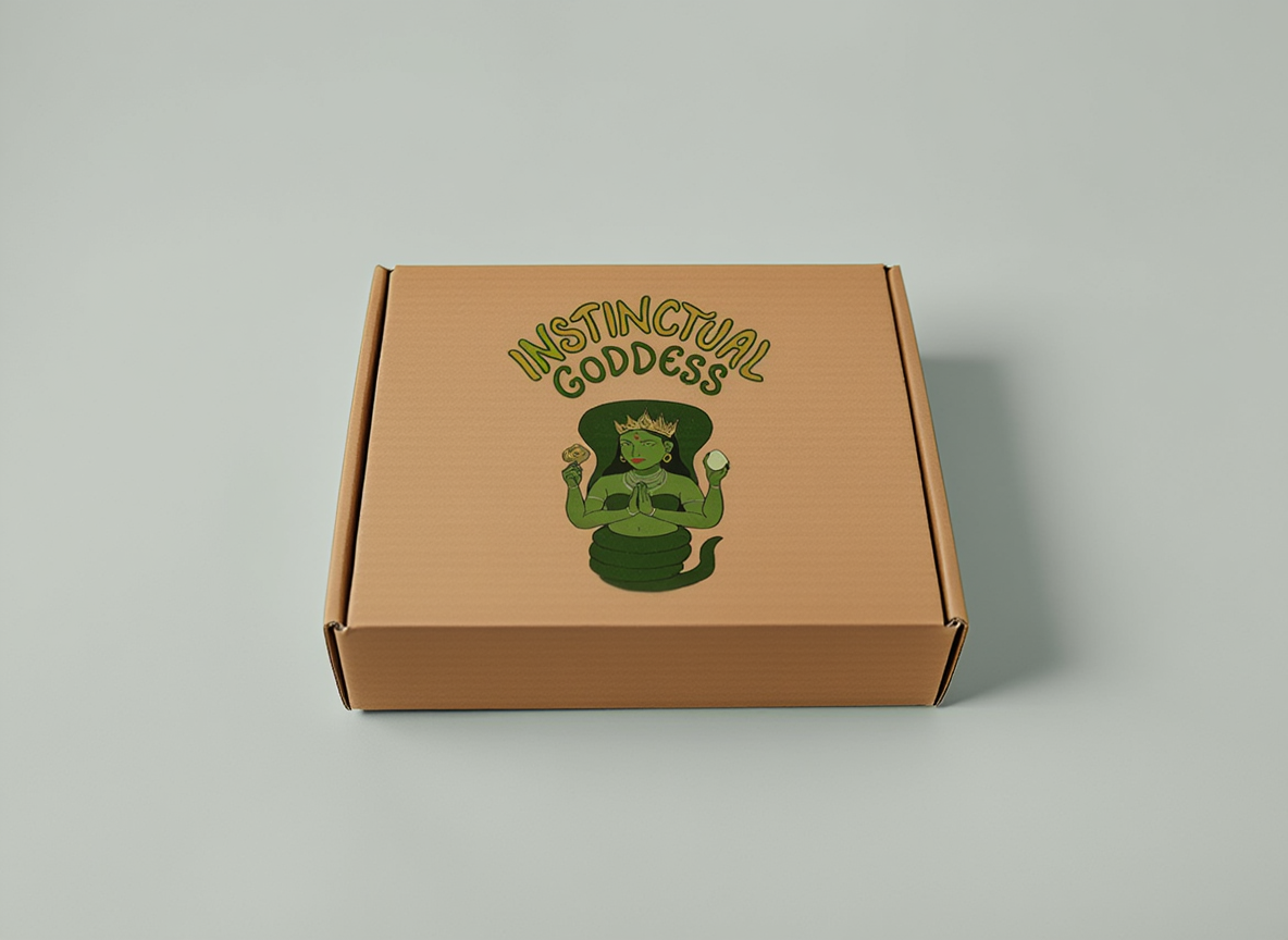
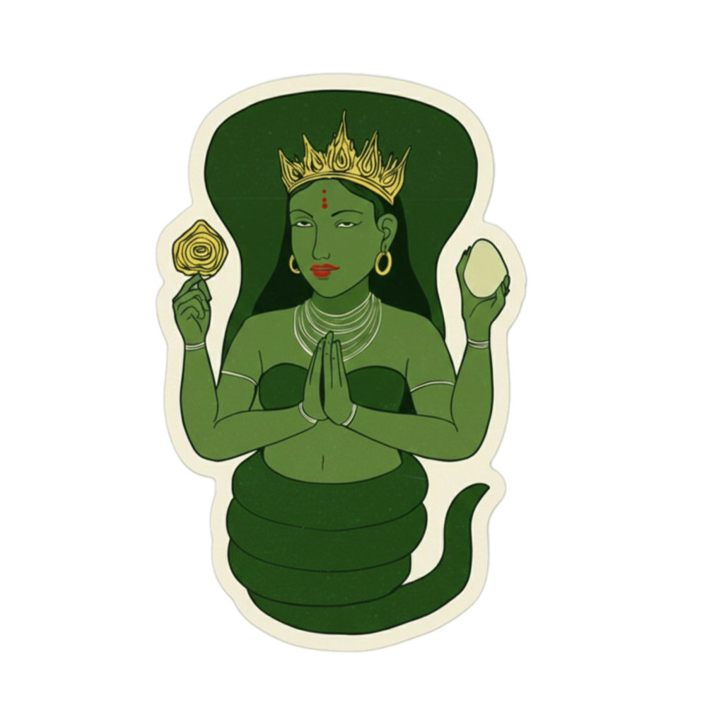
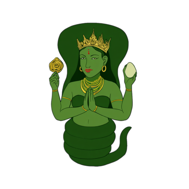
The symbol of the crown reinforces this:
it represents the moment the woman completes her ritual and steps into her own sublimity — elevated, centered, and sovereign from the inside out.
Project
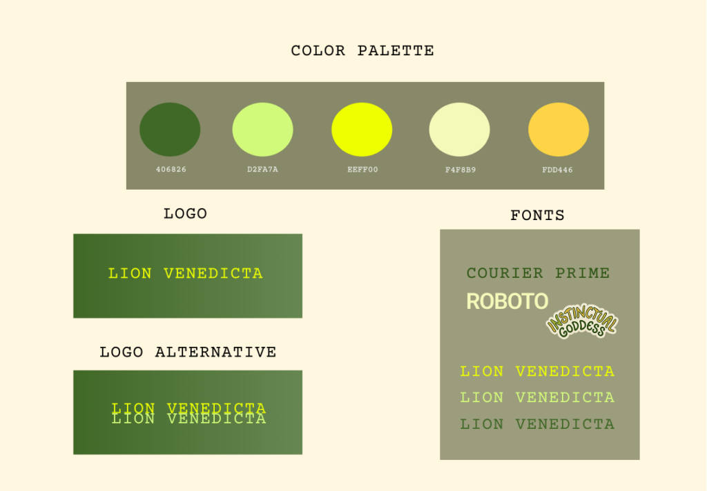
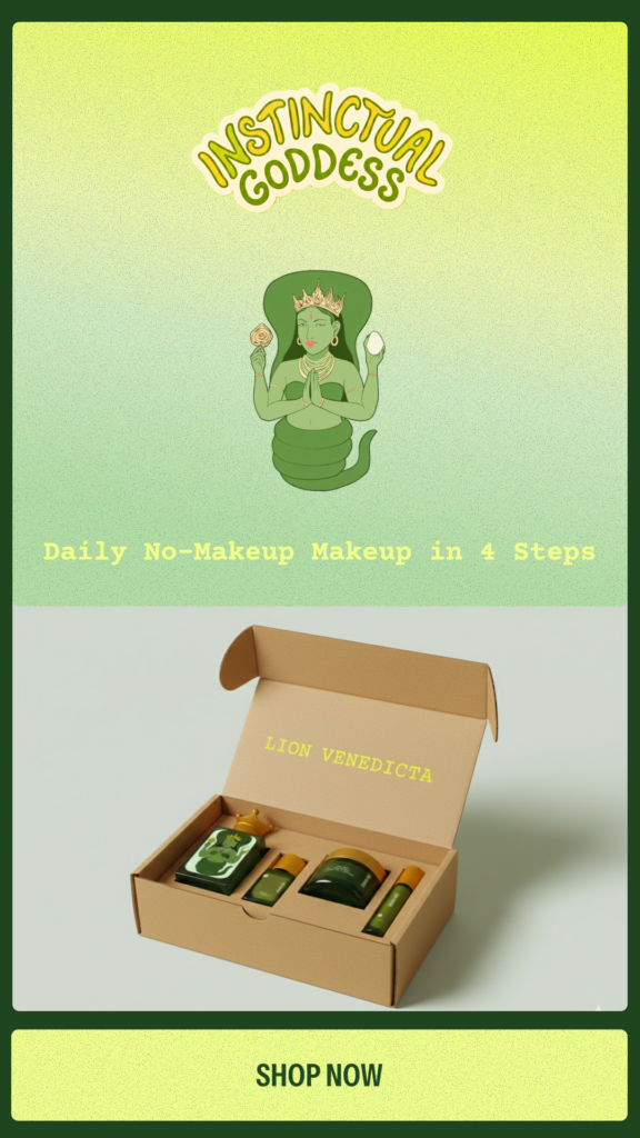
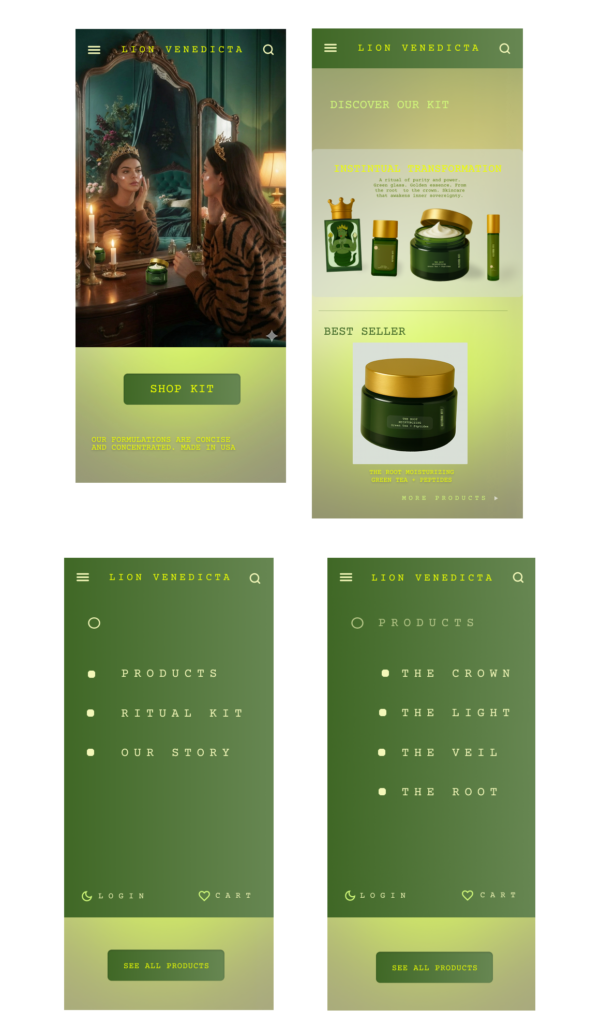
Lion Venedicta is beauty brand that evokes a mystical world where colors feel enchanted yet grounded, inviting women to feel effortlessly expressive. The visual language emphasizes beauty that is transformative without excess: you don’t need much to make an impression.
Rooted in organic ingredients, and skin-loving botanicals, and vitamins.
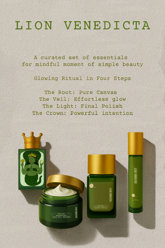
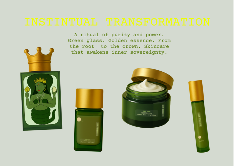
Each product in the ritual is formulated to enhance the skin’s natural vitality:
- The Perfume (“The Crown”) — signature eau de parfum blending the delicate sweetness of jasmine with the warm richness of sandalwood, completing the ritual with a lasting fragrance.
- The Concealer (“The Light”) — enriched with caffeine and vitamin C, it brightens tired areas, reduces puffiness, and adds a soft touch of life without creating heaviness.
- The Tinted Serum (“The Veil”) — infused with squalane and aloe vera, it hydrates, soothes, and evens the complexion while remaining feather-light and invisible on the skin.
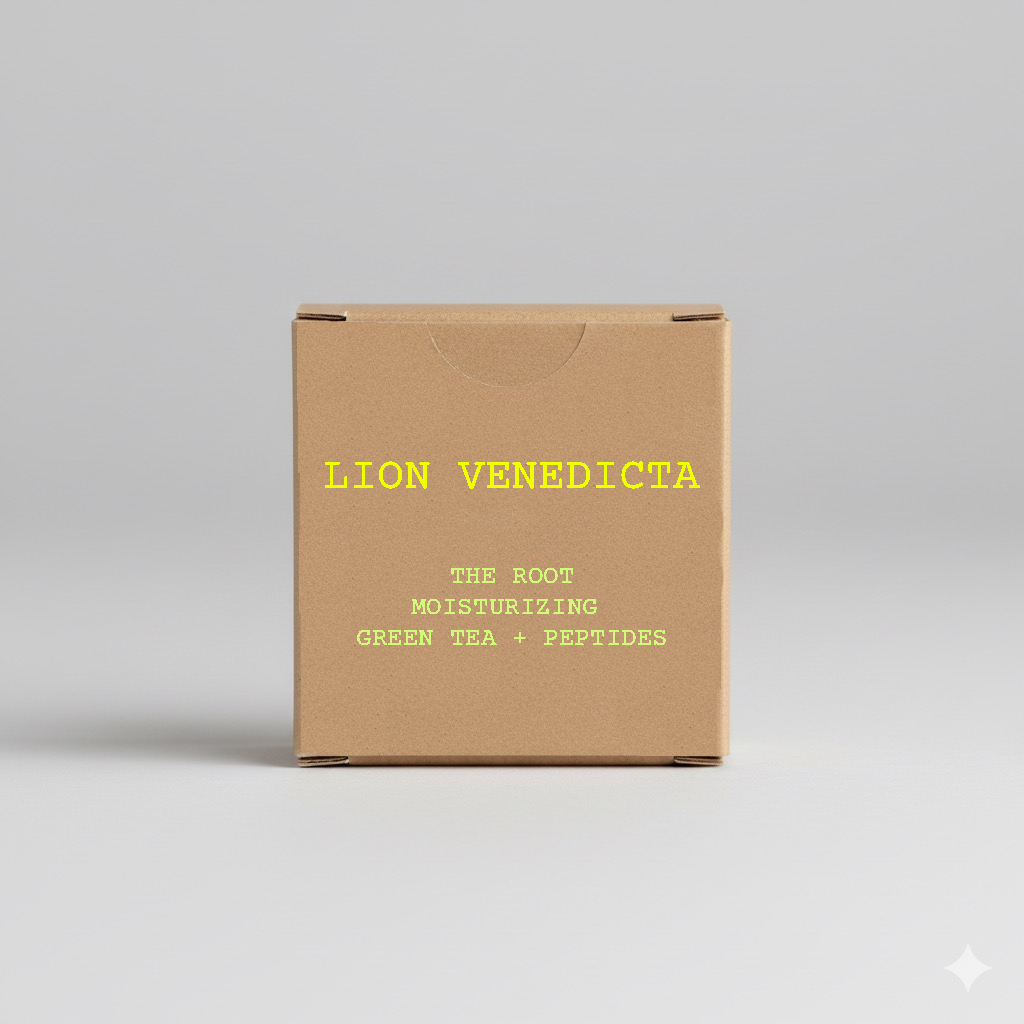
- The Moisturizing Cream (“The Root”) — powered by green tea extract and peptides, it strengthens the skin’s foundation, calming inflammation and boosting firmness from within.
Together, these essentials form a ritual where beauty is not constructed — it is activated, revealed through care, clarity, and the purity of high-quality ingredients.
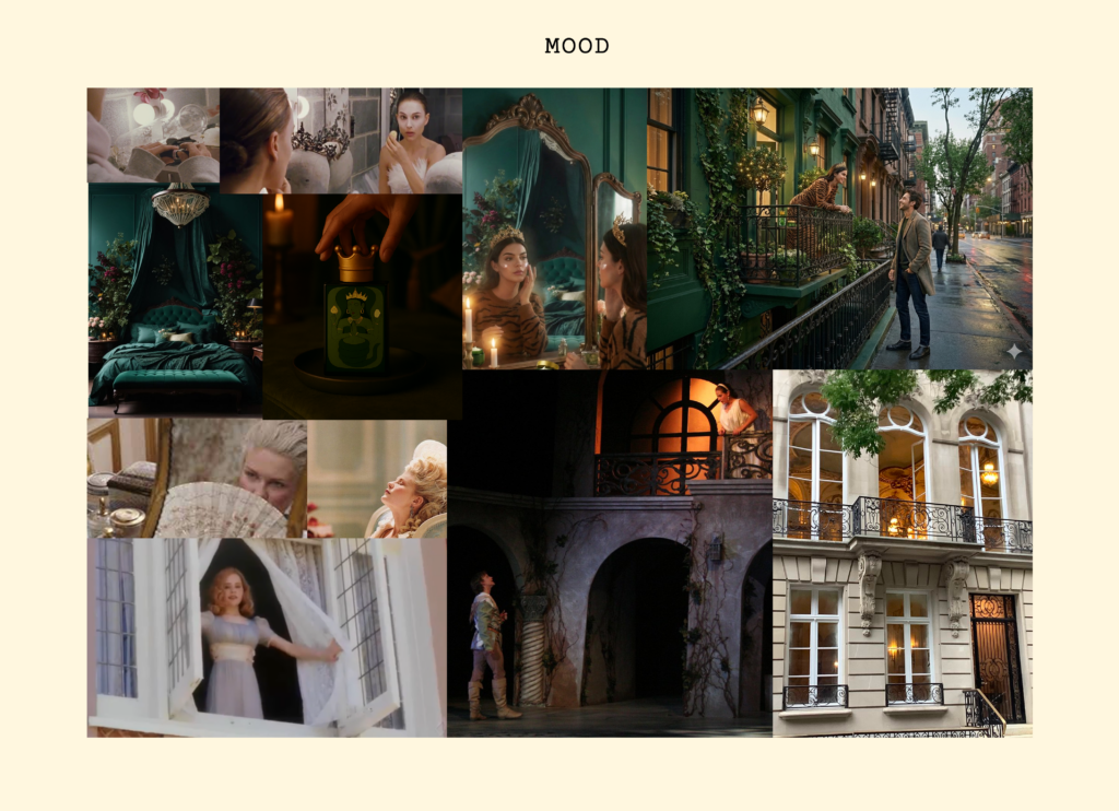
This project explores how the green goddess aesthetics merge to create a brand that feels deeply connected to the earth.
Challenge
The beauty industry is over-saturated with brands that promise transformation through excess; long routines, countless products, heavy formulas, and constant upselling. Many of these items sit half-used, expire quickly, or place unnecessary weight and fatigue on the skin.
The challenge was to create a brand identity that rejects overstimulation and instead champions a pure ritual:
a small collection of high-quality essentials designed to be used fully, while fresh, and without burden.
Lion Venedicta had to communicate:
- less is more,
- skincare as nourishment rather than coating,
- products that are luxurious but intentional,
- and the idea that true beauty does not require layers — only the right touch.
The concept needed:
- a fierce, feminine, devotional identity
- symbolism tied to felines, royalty, and genuine empowerment
- visuals that feel sacred but not religious
- a narrative identity that communicates nobility, and mythic presence
Creative Insight & Goal
Strategic & Brand-Focused
Today’s beauty industry overwhelms women with excess: too many steps, too many products, too much weight on the skin. My insight was that a brand could feel powerful not by adding more, but by offering fewer products with higher potency creating a ritual that feels intentional, and emotionally elevating.
The green goddess archetype taught me that beauty is a state of harmony. My goal was to design a brand that mirrors this: a ritual where every step feels symbolic, and needed but at the same time transformative allowing the wearer to return to a more natural, glowing version of herself.